



Design Foundations

The thinking behind the interface.

How this portfolio approaches clarity, identity, structure and interaction, shown through the decisions behind it.

Jump to section
01Design philosophyBack to contents ↑

Designed with intention.

Good design makes complex experiences feel clear. Behind every interface is a series of decisions about what matters, how people move through information, and where consistency helps.

Clarity before decoration.

Hierarchy, spacing and plain language do the work. Ornament stays out unless it carries meaning.

years across visual, UX & product design
20+
digital products designed and led
15+
POCs & interactive prototypes
150+
designers led across global teams
10+
The home page's own figures and labels: one weight change, no icons, no boxes.

Consistency without sameness.

A shared structure lets very different projects read as one body of work, while each keeps its own subject.

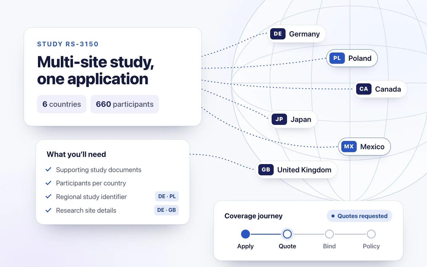
  • Enterprise product · Global insurance

    Global Research Coverage Platform

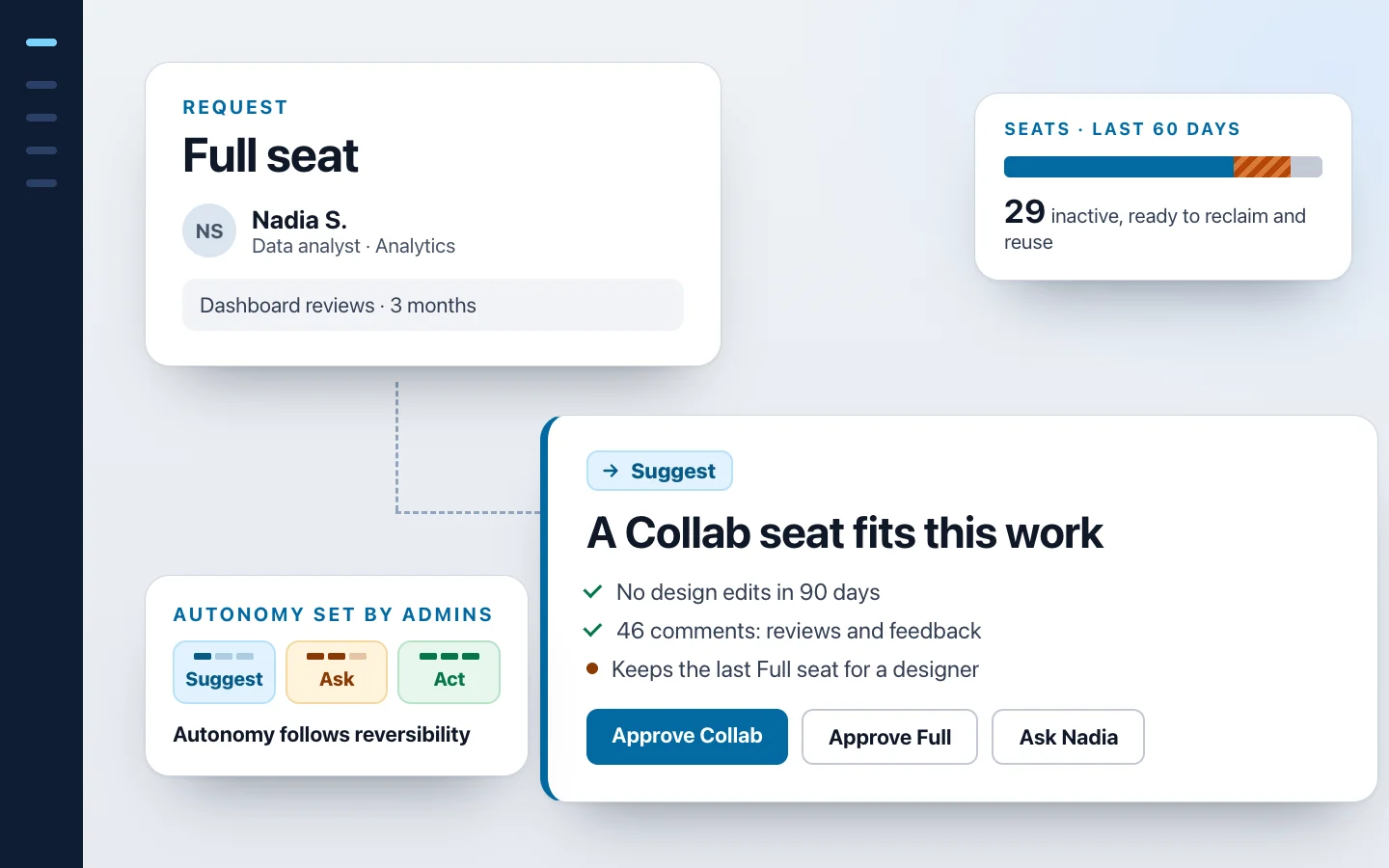
  • Real operational problem · Agentic AI concept

    Enterprise Tool Governance

  • Concept / POC · Regulated AI · Human-in-the-loop

    Claims Adjuster Copilot

Three subjects, one composition language: the case studies' published hero images, unedited.

Design that respects the person using it.

Links say where they go, focus is easy to see, and motion steps aside when a visitor asks for less.

Quick peek 2 min Read aloud as “Quick peek: Global Research Coverage Platform, 2 minutes”, so a list of these links still makes sense on its own.
Button, focus ring and accessible name as they are in the site's code.

A distinct identity, reduced to its essentials.

The Designed by Venu identity combines confident typography, a deliberate contrast in weight and one unmistakable orange full stop. Its expression remains consistent across physical and digital applications.

On lightDesigned by VenuFamiljen Grotesk 700 / 500Static full stop
On darkDesigned by VenuFamiljen Grotesk 700 / 500Static full stop
Corporate palette
  • Ink #15181E
  • Gray #4A5162
  • Page #E6E6E6
  • Navy #0F1D33
  • Orange #E8501A
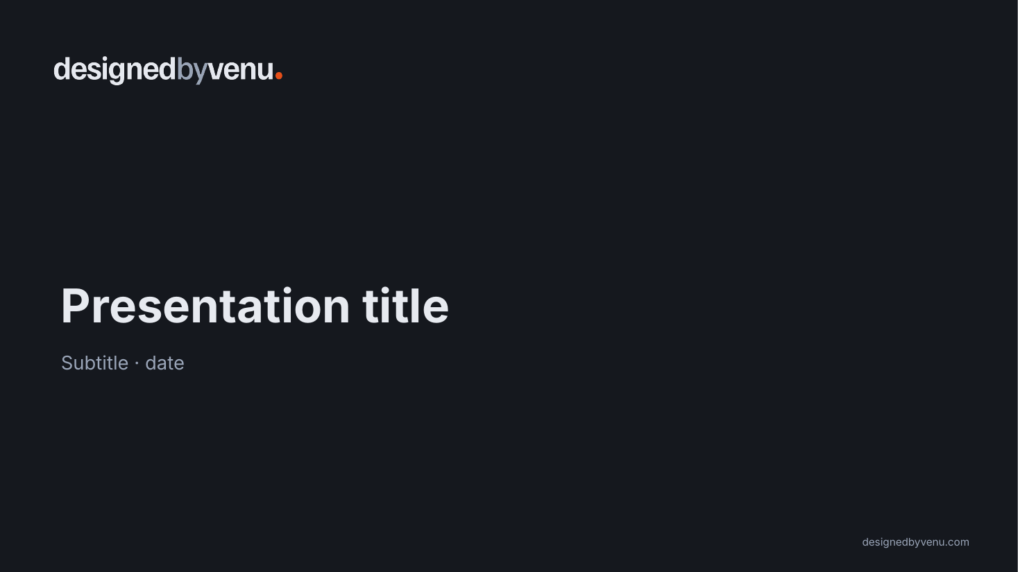
Designed by Venu presentation template, title layout
Presentation templateTitle layout
Designed by Venu A4 letterhead
LetterheadA4
Designed by Venu business card, front: the wordmark on a dark background
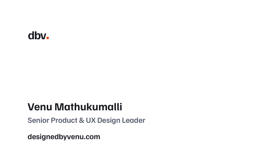
Business card, back: the dbv. monogram, Venu Mathukumalli, Senior Product & UX Design Leader, designedbyvenu.com
Business cardFront and back
03Visual languageBack to contents ↑

Structure gives an experience its rhythm.

Typography, space, color and composition work together to establish hierarchy and help people navigate information. Each decision serves the experience rather than decoration.

Cabinet Grotesk

Headings: confident, a little editorial.

Satoshi

Body: clear at small sizes.

--fs-heroExperiences people understand.
--fs-h2Selected product design work
--fs-h3Claims Adjuster Copilot
--fs-bodyTurning complexity into experiences people understand.
--fs-eyebrowProduct Design · UX/UI · AI

Corporate identity

Fixed. The logo and brand compositions such as slides, print and social.

Digital interface

Semantic tokens that swap per theme. Blue marks links, focus and structure.

Two oranges, two jobs
#E8501A is the mark. A graphic only, never behind text.
#C2410C is for actions. White text on it: 5.18:1 (calculated).
04Interaction in practiceBack to contents ↑

Details shape how an interface feels.

Clear interaction patterns help people move confidently through content. Navigation, actions, feedback and responsive behavior should work together without demanding unnecessary attention.

Case-study card

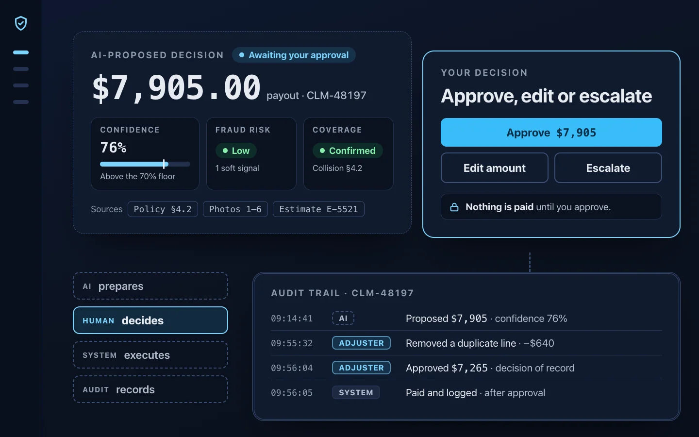
An AI-proposed $7,905 claim payout with confidence, fraud risk and cited sources, the adjuster’s choice to approve, edit or escalate, and an audit trail of who decided what

Claims Adjuster Copilot

Concept / POC · Regulated AI · Human-in-the-loop

A human-in-the-loop claims experience where AI prepares recommendations, while adjusters inspect the evidence, edit the decision, escalate uncertainty and approve every consequential action.

Quick peek 2 min

The image and the button go to the same place. Reading time is stated up front, so the visitor knows the cost before choosing.

Actions and focus

Get in touch View case studies ← keyboard focus

This portfolio website was built with AI assistance. The case studies represent my own design work. How I built this portfolio →

Filled for the step that matters, outlined for the rest. Standard buttons are at least 44 px tall. Keyboard focus shows a 2 px ring in the accent color, set 3 px away from the control.

Form feedback

Errors say what to fix, sit under the field, and are linked to it in code so assistive technology can announce them.

Status and labels

VerifiedEstimateAgentic AIInsurance

These projects are confidential. The work is presented and shared in person.

Meaning always has a word, never color alone.

Ask VEMA entry

Ask VEMA

One flat icon in the text color marks VEMA in the header button, the panel and every answer.

05Design responsibilityBack to contents ↑

Design quality includes what people don’t immediately see.

Responsible design considers accessibility, content accuracy, confidentiality and the people affected by every decision. These principles shape both the interface and the process behind it.

  1. Accessibility and inclusive interaction

    Color pairs are calculated in both themes, and controls are sized for touch.

    Calculated:14.24:1 ink on page4.75:1 link on page5.18:1 white on actionStandard buttons have a 44 px minimum height. Form errors are linked to their fields.
  2. Keyboard navigation and visible focus

    A “Skip to content” link comes first, and every focusable control shows the accent ring.

    Esc closes the phone menu and returns focus to the menu button. It also closes Ask VEMA.
  3. Reduced-motion preferences

    When a visitor asks for less motion, the site stops moving rather than slowing down.

    The intro reel never autoplays, sections appear without sliding in, and smooth scrolling is turned off.
  4. Respect for client confidentiality

    Public case studies use anonymized client names and leave out identifying logos.

    Confidential work is presented in person, and confidentiality notices use the same lock-icon treatment.
  5. Accurate representation of original work, concepts and outcomes

    Concept work is labeled as concept, and modeled numbers are never presented as measured results.

    Concept / POC  Real operational problem
AuthorshipWhose thinking is this?
The case studies

They originate from my own ideas, product reasoning, research, design decisions and hands-on work.

The website

AI assisted with implementing this portfolio. It did not create the thinking behind the case studies.

Foundations are easiest to judge in the work itself.